Live project
Bouplan Ontwerpers
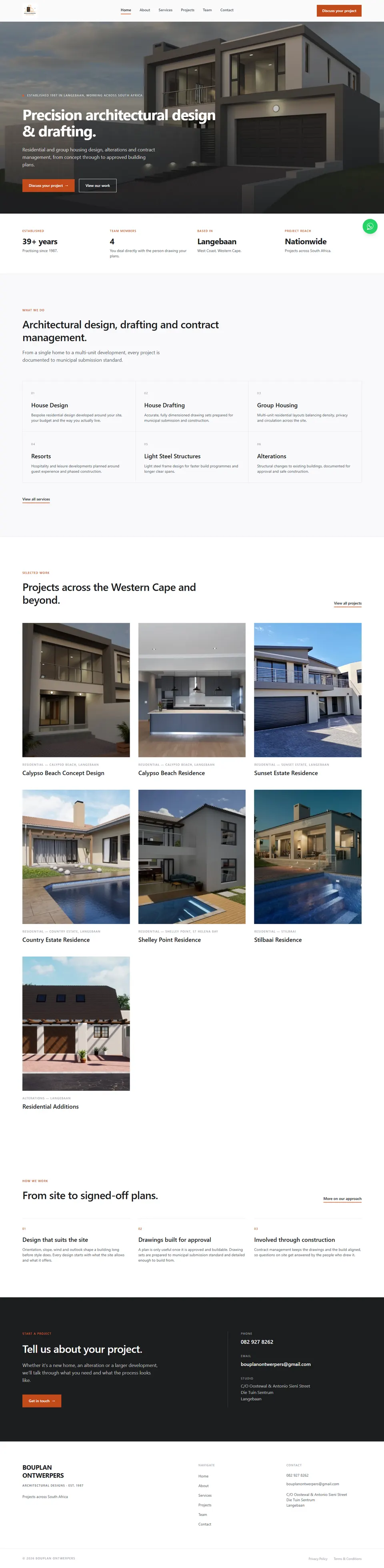
A premium website concept developed for an established architectural design practice operating in Langebaan, West Coast since 1987. Built with Next.js, TypeScript, and Tailwind CSS v4, the site translates the practice's existing brand identity into a modern digital experience, with a focus on accessibility, local SEO, and a typed content architecture that allows real project photography and client content to be dropped in without any component changes.
- Technologies
- 5
- Key features
- 14
- Deployed
- Live
How I built it
- 1
The problem
A practice running since 1987 had no proper website, and no real project photography or copy had been supplied yet.
- 2
Key decision
Don't invent anything. I stripped out fabricated names, history, and statistics from early AI-generated concepts, and built a typed content layer with honest placeholder states so real photos and copy can drop in without touching a single component.
- 3
The result
A live multi-page site with a WCAG AA-tested palette, local SEO structured data, and a content layer the client can fill in without a rebuild.
The Problem
Bouplan Ontwerpers has operated since 1987 but had no properly developed website, leaving a practice with nearly four decades of experience effectively invisible online. Prospective clients had no way to view their work, understand their services, or contact the right person. The project establishes a credible digital presence built around local search visibility in Langebaan and the wider Western Cape, while deliberately avoiding fabricated projects, statistics, or credentials.
My Role
Full-stack developer and UI/UX designer responsible for the design system, component architecture, page development, accessibility implementation, SEO structure, and deployment. Work included auditing the practice's existing branding, defining the typography and colour system, and structuring the content layer so the client can replace placeholder material without a rebuild.
Key Features
- Multi-page architecture: home, about, services, projects, project detail, team, contact, and legal pages
- Design system derived from the client's existing logo, with defined colour, typography, and spacing tokens
- WCAG AA contrast-tested colour palette with a separate accessible shade for orange button fills
- Filterable project gallery with categories derived from live data
- Dynamic project detail routes pre-rendered at build time
- Accessible image lightbox with keyboard navigation, swipe gestures, focus management, and scroll locking
- Contact form with client and server-side validation, honeypot spam protection, and a swappable email handler
- LocalBusiness structured data, generated sitemap, robots rules, and per-page metadata
- Open Graph tags for link previews on WhatsApp and social platforms
- Typed content layer separating all copy and data from component code
- Reduced-motion support across all animations and hover states
- Honest placeholder states for unsupplied photography and content
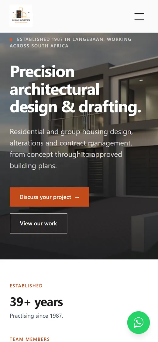
- Responsive layouts designed per breakpoint rather than scaled down from desktop
- Production deployment on Vercel
Challenges
The central challenge was building something that looks like an established practice's website without inventing anything to fill the gaps. Initial AI-generated design concepts included fabricated project names, invented company history, and false statistics, all of which had to be identified and stripped out. The site was instead structured around clearly marked placeholder states that look deliberate rather than broken and upgrade automatically once real content arrives. Accessibility required genuine attention rather than assumption, since the client's brand orange failed WCAG AA behind white text, so a deeper variant was introduced for button fills while the original colour was reserved for non-text accents. The project also involved decisions beyond code, including choosing an email-only contact architecture over an unnecessary database and documenting exactly which information still requires client confirmation before launch.